Confluence - data experience
2025
Confluence is an experience which turns passive data into active dialogue
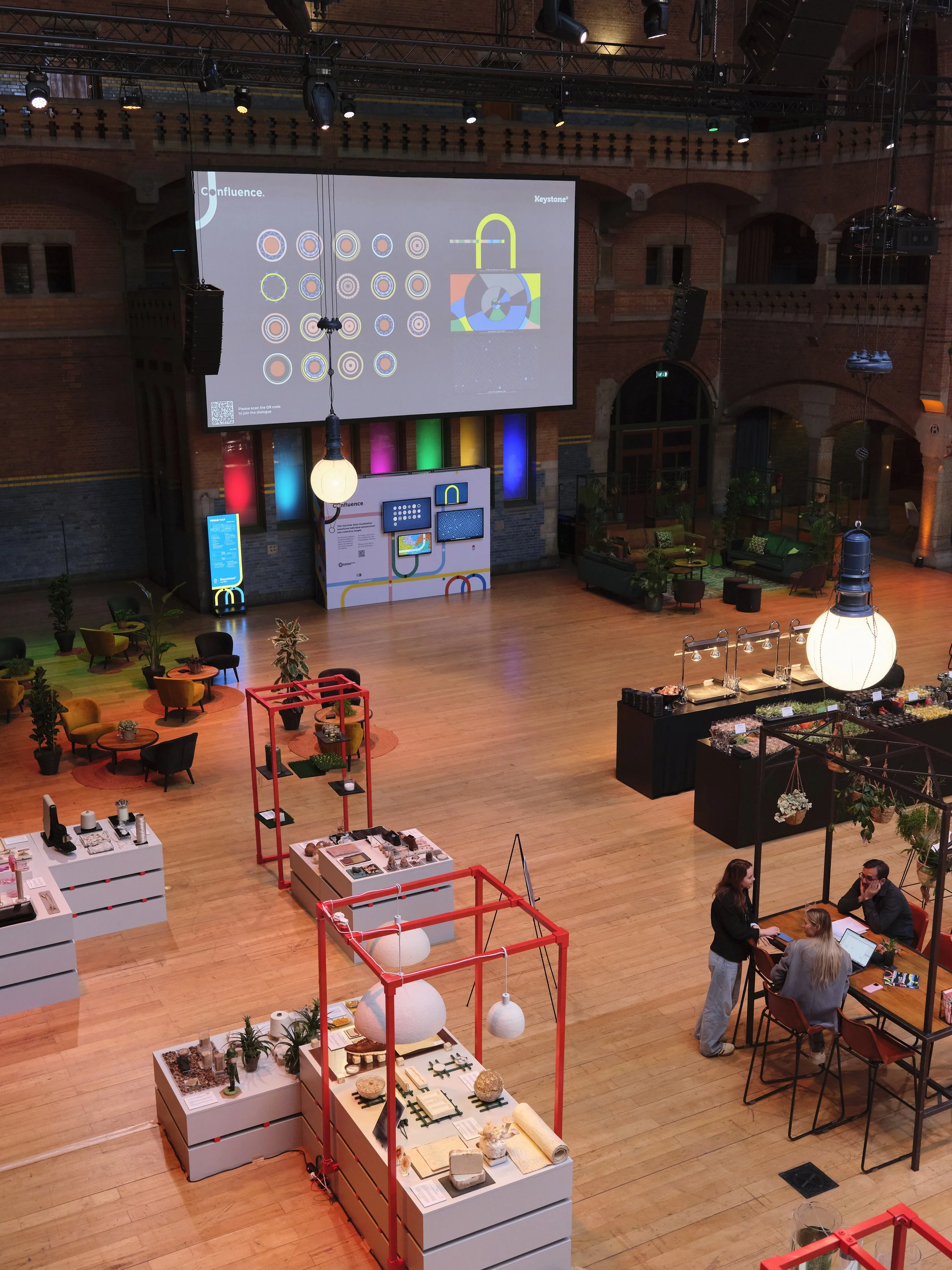
What that means: An in-person 2-day event required an experiential feature to transform the large main hall into a space for connection. The challenge was to move beyond traditional event materials and create a shared data experience that would encourage attendees to stop, reflect, and engage with facilitators and each other.
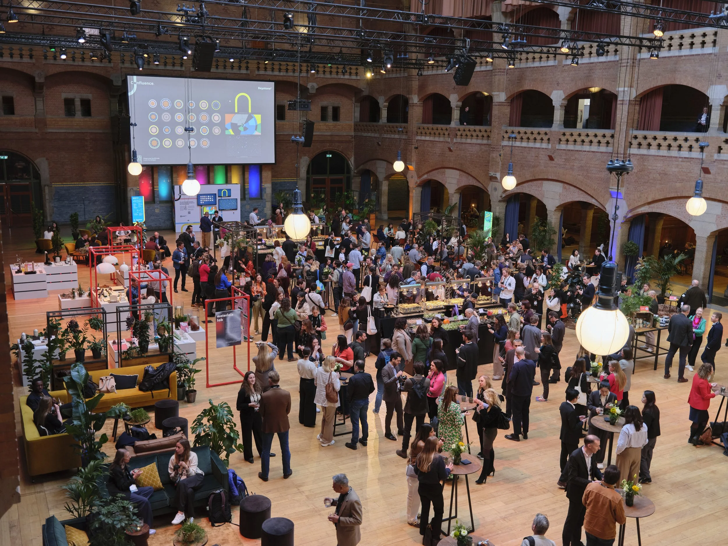
Grégoire de Brevedent d'Ablon // Victor & SimonThe Solution: Real-time data visualisations
Confluence: the coming together of two or more waterways
We designed Confluence, a data experience centred on the metaphor of ‘coming together’. The event’s theme centred around keystones, so central to bridges. Hence, we played around with the concept and landed on confluence.
Data collection: Attendees quickly completed a 5-question, multiple-choice survey via a scanned QR code. Data was sent to a Google Sheet and processed in real-time.
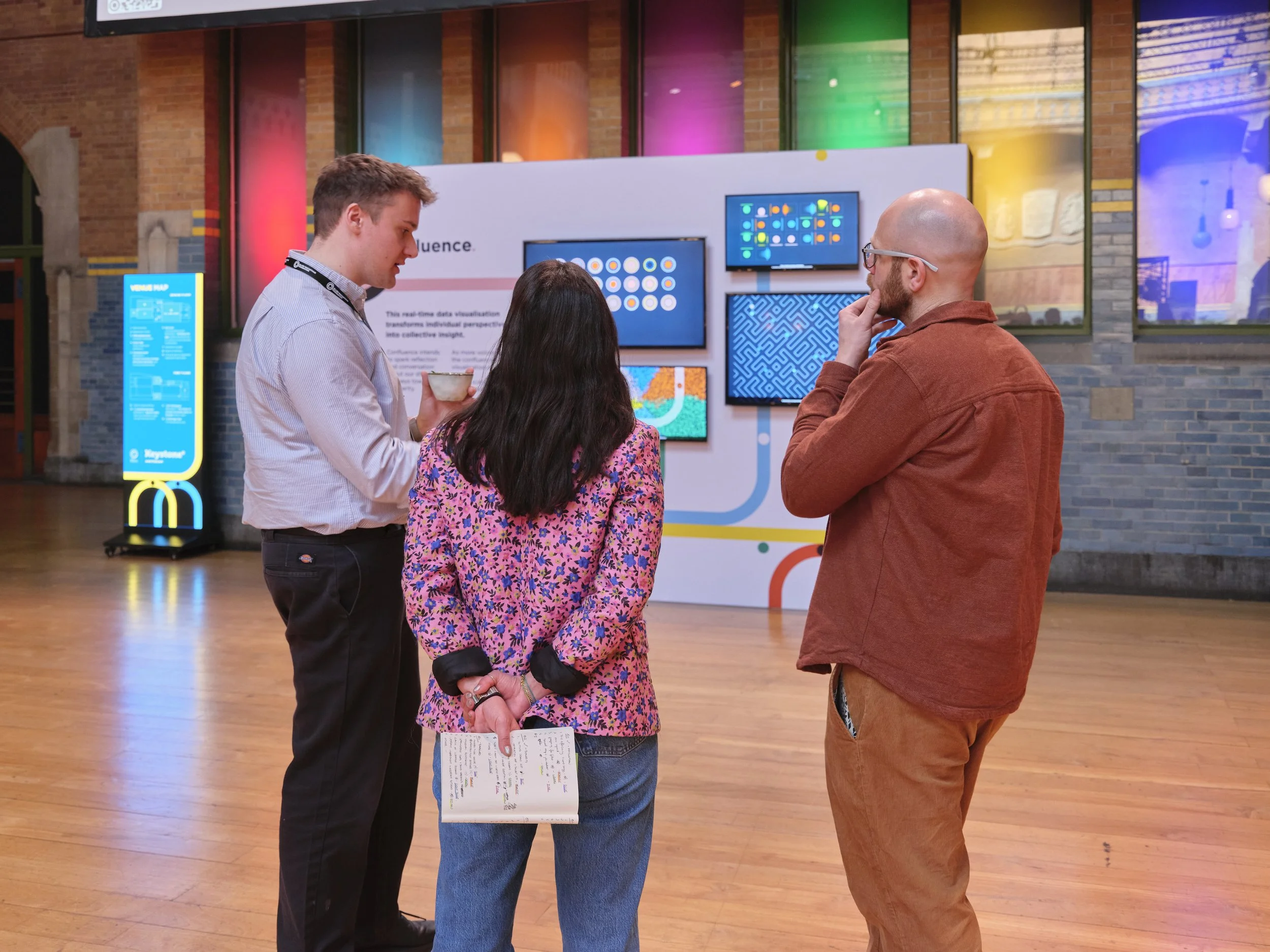
Data visualisation: We aggregated replies and used data vis. Instead of standard bar charts and pie charts, we created abstracted, animated visualisations projected onto TVs and large screens. These visuals played further with the confluence metaphor. For example, we used the concept of bridges to represent enablers identified by participants.
Execution: Design for curiosity
The key was designing an experience for conversation. The data visualisations were deliberately designed without legends, an unconventional decision.
Goal: The visual impact (for example, seeing an overwhelming amount of a certain colour) would prompt participants to ask, "What does the colour 'Y' represent in this chart?"
Outcome: This required participants to engage with a facilitator, often while in a group setting, turning a simple data display into a facilitated discussion about their hunches, priorities, and why others might have responded differently.
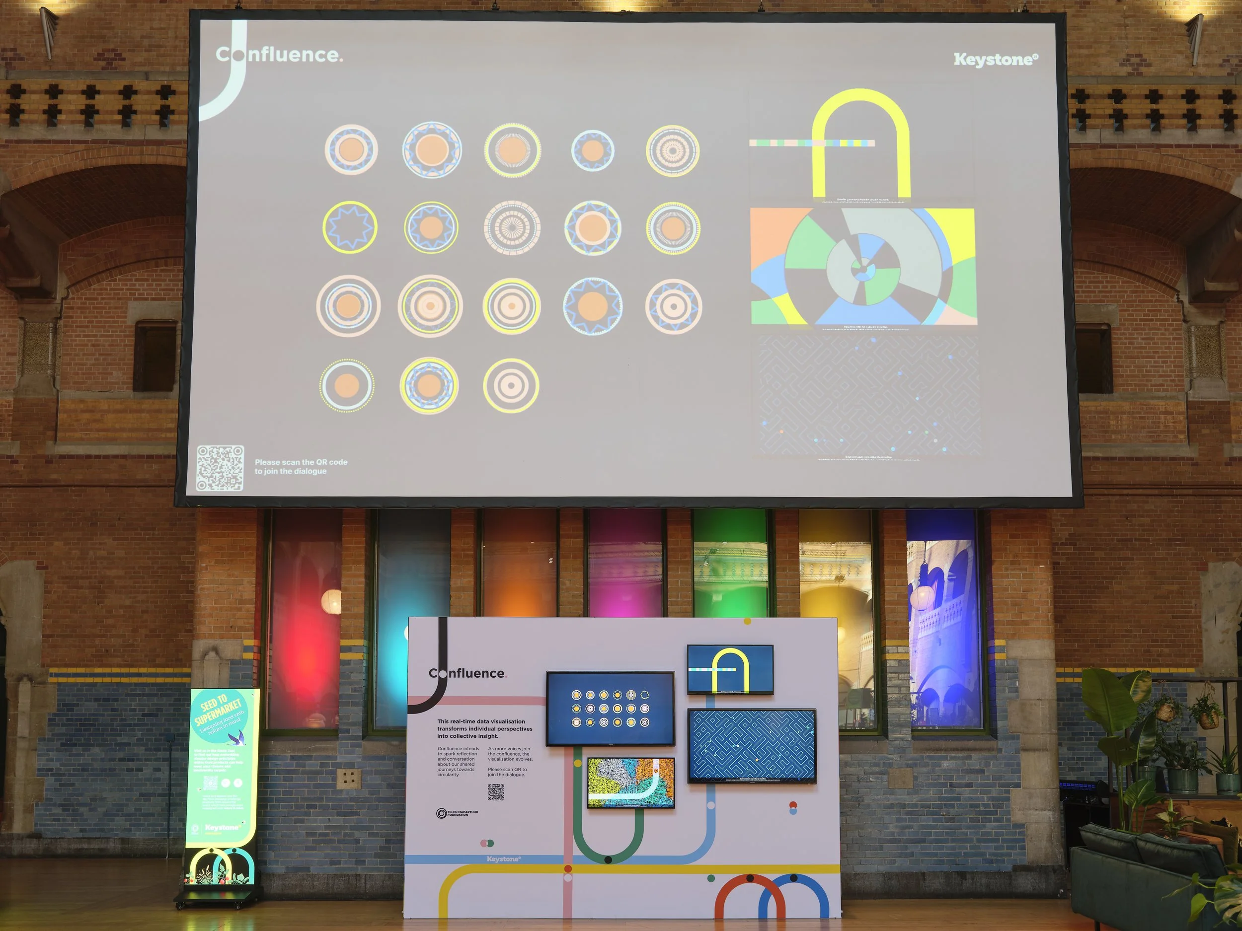
Grégoire de Brevedent d'Ablon//Victor & SimonResult: Valuable insights and conversation drivers
Increased interaction: The colourful space captured attention, ensuring participants stopped, asked questions, and spent time reflecting on the trends.
Rich qualitative data: The facilitated conversations generated significant, unexpected research on attendee priorities and insights, proving the value of the experience extended far beyond the initial survey.
Connection & outliers: The visualisation of results helped attendees immediately identify similarities and differences in perspective, highlighting potential "outlier nodes" whose unique skills could be leveraged as connectors for the wider group.
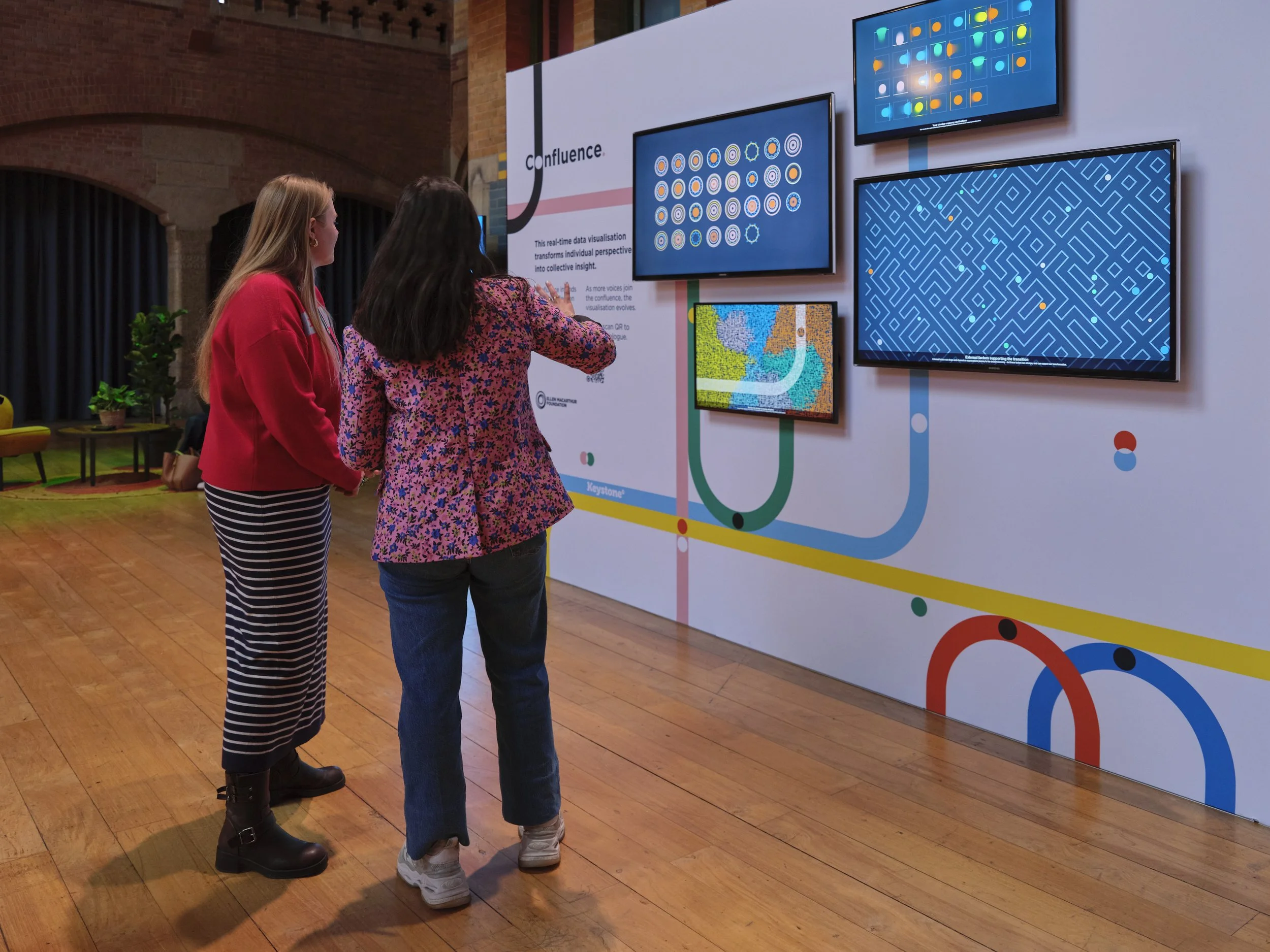
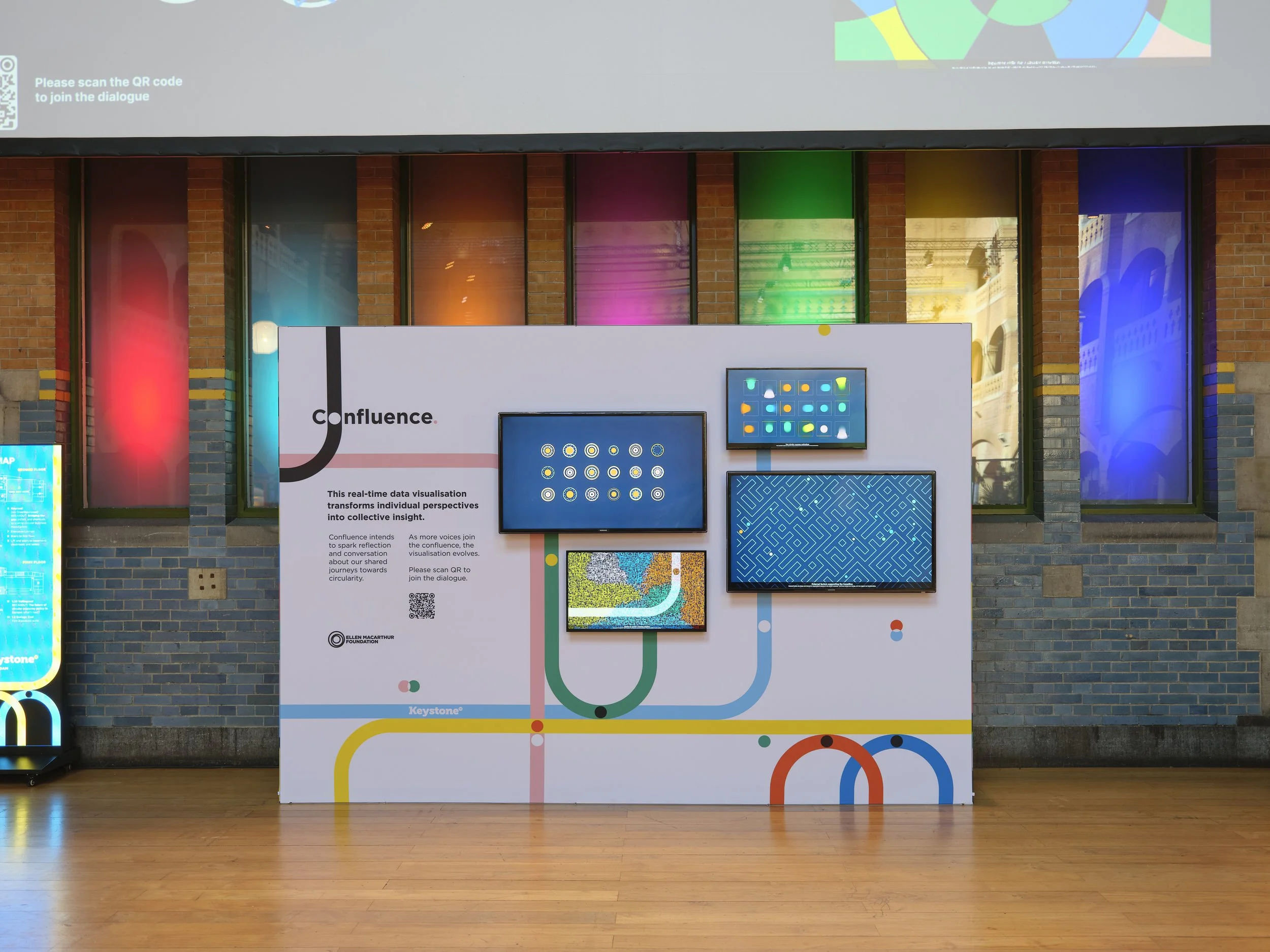
Grégoire de Brevedent d'Ablon//Victor & SimonTeam
This project was done in collaboration with the fantastic and stellar Yunus Tunak (chief designer & tinkerer), Nick Dover (viz design), Alex Hedley (space design) and Jo Williams (events manager).
Get in touch!
Want to recreate this session or look at other ways of working in your team? Get in touch on hello@thedataknitters.com
Grégoire de Brevedent d'Ablon//Victor & Simon